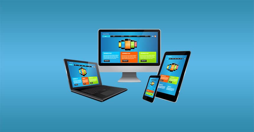
Responsive Website Design
Responsive website design is a website that re-sizes to the device you are using, for example if you grab the corner of your browser and make the screen smaller or bigger the a websites layout and content will change to fit the size of the screen. This type of website is a must have in the market now days as more and more people are using their tablets and mobile devices to research the internet and still using their laptops and pc’s during working hours.
Responsive website design gives you a huge advantage over the average HTML web development as you get to target all devices that have any browser functionality. Before responsive websites came out most companies that were looking to target mobile and pc users had to have two websites, one that you would view on your pc or laptop and another that would be viewed on your mobile or tablet, redirecting depending on the device you are using, this way of doing it was always a lot of work because every time you need to update your website you would have to update both websites not to mention a much more costly approach. With responsive websites you now only have to update one website that will adjust to work on multiple devices. Responsive websites are being built in content management systems (CMS’s) making it even less of a hassle to update and take care of your website. Content management systems give you the ability to login to your website from anywhere in the world, make your updates and changes and logout, without the help of a web designer. A CMS is a management system for non-technical users to update and change their websites in a visual manner as an alternative to coding. Picture a CMS as a glorified Word Document with added functionality.


