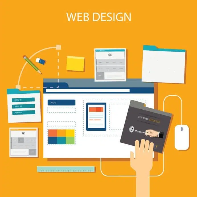
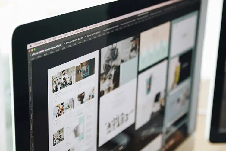
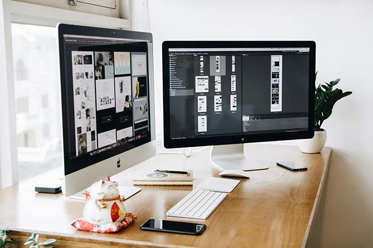
2018: Website design trends
Another year has come and gone, and when this happens, it’s always exciting to see what the new year might have in store for us. Although no one can know for sure what 2018 may hold, in the world of digital, it’s very important to think ahead. We think there are a few trends that will continue to dominate the website design space as well as some new trends that will certainly make 2018 a memorable year for website design trends.
From balancing a website’s aesthetics with its functionality to ensuring user engagement, here are some website design trends for 2018 to keep track of if you want your business to remain relevant:
Progressive Web Apps
With the rise in popularity of cellular devices, it may come as no surprise that apps make up a large portion of the time spent on mobile media. And don’t think for one second that website designers like us don’t notice. We picked up on an important trend that is happening, blending the best of web and app behaviours.
This hybrid creation is referred to as a Progressive Web App. We are sure that in the new year, there will be a trend in businesses upgrading websites to add elements such as animated page transitions, splash screens and push notifications.
Increase in Artificial Intelligence (AI)
In 2017, we saw tremendous growth in the use of artificial intelligence (AI) and machine learning. Because of AI assistants like Siri, people are now less intimidated by this technology and more comfortable to converse with machines. So, it may not be surprising that a prediction for website design includes the use of AI tools by web developers all over the world.
We predict that as AI and machine learning continues to advance, we’ll start to see them make their way into web design in many new and advanced ways.
Always back to responsive
Responsive design is all about making sure that your website is designed in a way that it resizes to look appealing across multiple screen sizes. This may not sound that important, but think how frustrated you’ve been when a website isn’t displaying correctly on your phone.
While this trend is not necessarily new, responsive design is now more than a trend – it has become a principle. Although it’s been around for a number of years, we predict that the importance of responsive design will be highlighted by its growing need.
Bright and vibrant
Another upcoming trend we predict for 2018 is the increase in bright, bold colours for website design. These bold colours will be complemented with modern, bold fonts to make sure that the website creates a statement. Websites need to capture the attention of the visitor quickly and going with vibrant colours is definitely one of the ways to achieve this. This colourful trend can be attributed to technological advances in monitors and devices that boast screens that are more suitable for reproducing richer colours.
Mobile First
Did you know that mobile browsing has now officially surpassed desktop browsing? In this modern age we’re living in, everyone is now effectively carrying a computer in their pocket, constantly connecting them to the world of the web.
Website design for mobile has grown a lot in the last few years. Consequently, Google is rolling out its new Mobile First Index in 2018, which means they are placing a lot more importance on the mobile version of your website by making it the first to be seen in the search results. This means that having a mobile-friendly website design is no longer an option, it is absolutely crucial.
To start the year for your business with a bang, please contact us